On Thursday, I joined a couple thousand other people in attending the ATX Startup Crawl, as part of Austin Startup Week.
 In case you’ve never been to a crawl before, here’s a quick rundown: It’s essentially a giant party showcasing local startups (as well as a few well-established companies), complete with free food and booze. Companies participate by running shuttle buses between their headquarters, or by renting small tables at the main hub location where they can network with attendees, hand out free swag, get some free publicity, and then stumble home drunk at the end of the night.
This was the second crawl that Capital Factory hosted this year; the first one taking place the day before SXSW 2012 began. And on that note, Kudos to Joshua Baer and his crew at CF, as the whole Austin startup scene is very clearly benefiting from their hard work.
Mission: Update Wardrobe
Before mingling with old friends and making new connections, my first order of business as a veteran of these events, was to quickly grab a cold beer and then visit the various tables for a fashion refresh, before the smaller or ill-prepared companies ran out of their newly minted tees.
Of course, just about any company that survives beyond their LLC filing sooner or later has some form of corporate identity and/or swag printed up. Big deal.
But, if you’ve spent any time in or around a bonafide start up community, like in Austin, “The Valley”, or Boulder, you are likely familiar with the reigning king of tech swag — the almighty t-shirt (apparently “beer koozies” are now a close 2nd…). Heck, many startups pass out t-shirts before they complete their MVP, my last company included (R.I.P.).
This phenomenon is easy to explain. You see, a t-shirt is a real physical thing. A collection of threads and fibers that can be seen and touched, in a way that ones and zeros cannot. It’s a step, albeit a small one, towards actually existing. It simultaneously serves as a badge of pride for the team, AND, as a long-term branding & marketing opportunity on the backs of supporters (as well as beggars like me, whose entire wardrobe could double as an Austin startup directory).
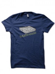
*not an actual company…. I hope.
And so, the first order of business for the team at Matttresss: “The Pinterest for dating” — is to spew their bright pastel logo into a Photoshop file, and send it off to be printed on ultra-soft-eco-friendly-organically-grown-PETA-approved t-shirts, which cost more than the company will eventually raise in their seed round.
Prioritizing a bit of expensive swag isn’t really the issue here though. Just as long as it’s thoughtfully designed — as in — by utilizing a functional brain somewhere in the process.
How To Design A Killer T-Shirt
Here are the two ingredients that comprise an effective company tee, and one bonus ingredient that should be strived for:
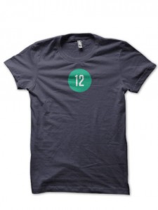
Blah. Until you’re a Twitter or Facebook, very few people will have context for this shirt. Sure it’s their logo. But to me, it’s just a number on a t-shirt.
- Quality Material: A soft, high quality t-shirt is a thing of beauty. Even fashion-comatose geeks subconsciously desire that nice American Apparel or Next Level feel, over some cheap sheet of stiff cotton that hangs to their knees, such as a lower-end Gildan. After all, what good are your new t-shirts if nobody wears them? Fortunately, most of the startups around here have NAILED this, as I eluded to earlier.
- Clear & Consistent Branding: The message on your company t-shirt should fit your brand! A well-sized logo and appropriate tagline for context, printed on the front of a fabric with good color contrast, is a sure-fire way to get this right — especially if you feel like you’re stretching for something more creative. You’re creating a walking billboard with limited useable area, so resist the temptation to print some ambiguous statement in 16pt font, or a cryptic symbol that only your psychic Aunt Ellie understands. THIS is where many companies fail miserably.
- The “It” Factor (Bonus): This is what separates the men from the boys, and is appropriately difficult to pull off. This is the ingredient that causes strangers to actually notice your t-shirt. It can be something funny, thought provoking, curious, or any number of other well-executed elements that clearly separate you from the crowd and grab attention. Done properly, a tee with this factor is worn and noticed more often (increasing impressions), discussed more often (click throughs?), and potentially acted on more consistently (visits, follows, sales, conversions). If you want your swag to function at it’s highest level, this is the key ingredient.
If you got the first two right, good work — your t-shirt is passable, people will look good in it, and it will help to increase awareness and brand your new company. Find a tasteful way to add your web address or twitter account to it, and it might even drive some conversions.
If people are laughing, asking questions, and commenting favorably and often about your t-shirt — then this is an indication that you nailed all three ingredients. Congratulations, you have the holy grail of wearable swag!
Unfortunately, many companies fail this test, sometimes even at older companies with spotless track records in the swag department. The newly-acquired pile on my desk from Thursday contains proof. Wasting precious time and cash on seriously bad swag that fulfills only one or fewer of the above IS a problem.
Here’s some real world cost data to drive this point home.
I was recently in charge of marketing for one of the best damn teams I’ve ever been a part of, at WP Engine. These guys are undoubtedly the best WordPress hosting company in the world (shameless plug), and getting better every moment.
The last batch of t-shirts I worked on at WPE before my departure (which I’ll write about soon) ran the company approximately $6,000 for 1000 shirts, which they buzz through very quickly on their conference and event trail. And this is quite a bit cheaper than they were prior to finding a better vendor.
While this IS a lot of cash to spend on t-shirts, it was well worth it for WPE because their shirts were awesome — totally nailing the 3 ingredients above.
However, not every startup company is well funded or succeeds at doubling revenue every few months like WPE, and so careful attention must be paid to how effective each dollar is that’s being spent, even if it’s just a ballpark guess. This amount of money could absolutely make bigger waves spent elsewhere if your shirt sucks ass. This is the case at WP Engine now with their latest shirts, which definitely lack $6/ea worth of impact!
Good Shirt, Bad Shirt
Let’s look at WP Engine’s previous t-shirt and compare it to their new one. Then we’ll evaluate how handing out the new one is akin to burning six one-dollar bills each time.
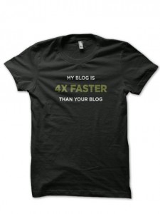
Back Side:
“Finely Tuned WordPress”
“WPEngine.com”
In case you’re brain dead (as if anyone is actually reading my first blog anyway!) and don’t understand what’s good about this shirt, allow me to explain… EVERYTHING is good about this shirt.
- It’s comfy, fitted, soft, and durable
- It fits the brand perfectly both design-wise, and through it’s smart way of conveying one of the startup’s biggest benefits: speed. The logo and tagline are adequately sized and placed smartly on the back of the shirt (not shown).
- Major “it” factor. I wore this shirt damn near everyday for months (clean ones, of course!), and I stopped counting how many conversations and laughs I got out of it from strangers after the very first day! No joke. The ONLY item in my wardrobe that even comes close to this shirt as a conversation starter, is my pair of Vibram “Five-Finger” shoes.
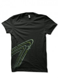
Back Side (similar style, but swoop at top too):
“Finely Tuned WordPress”
“WP Engine”
Words are small and integrated sideways into the swoops, like the front.
So what about the new shirt? Let’s go down the list.
- Comfort and fit? Bingo. They never skimp in this department.
- Branding/Clarity? Double-Fail. Aside from the little bit of color, the design absolutely fails in fitting their brand. Nothing at WPE has ever been wildly modern, contemporary, or splashy — and that’s a good thing. It’s also impossible to read at a distance, the logo and tagline are tiny and placed in terribly awkward locations — which is only really appropriate on more formal or embroidered shirts in terms of effectiveness. When the shirt is on your body, the design gets REALLY awkward looking.
- “It” Factor? No Chance. They actually achieved the opposite! Not a single conversation, smirk, or smile have I experienced with this shirt in the few days I’ve worn it in public. That is, unless you count the two people, plus my wife, who have commented on how ugly it is, and how it makes me look like I’m “trying too hard” — think: Jersey Shore, or “Bro-wear”. Add a gold necklace, a watch the size of your fist, and some flashy sunglasses and you’re all set!
It completely fails at conveying to people how much WPE, it’s product, and it’s culture totally kick ass — which their past t-shirts did in spades. It’s an incredibly easy shirt to ignore completely. My dear friends, if you read this — I don’t care how many people have complimented you on this design — I promise you you’re better off handing out the old ones, including “Fireball Proof”, until you can come up with something better. Shit, I’m tempted to design something for you myself.
If you’re reading this and you’re one of those design agnostic people (aka engineers), who insist that “good” design is a matter of opinion, I have news for you — you’re wrong. There are cold hard truths about good design that usually must be obeyed to achieve a positive impact — especially if you’re a bit handicapped in this skill to begin with.
The most important truth in this circumstance, and the only one I’ll get into here for the sake of brevity:
Simple is King.
Simplicity is always in style. It will always be appreciated by greater numbers. Simplicity is easy to understand, easy to talk about, easy to evangelize. This is true in many more areas than just design.
If you’re not 110% confident that your new design will be a massive hit, scrap it now, and start over with something clear and simple. You’ll be glad you did.
Let’s wrap this up with my favorites…
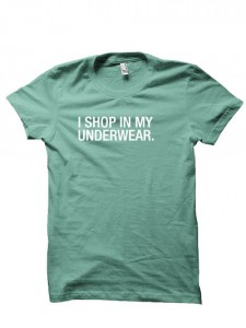
“I SHOP IN MY UNDERWEAR.”
adlucent
The best shirt handed out at the Startup Crawl on Thursday — “I SHOP IN MY UNDERWEAR.” by adlucent. Simple, funny, and totally smart for their brand. My wife is wearing hers at a local poker game as I write this.
Also, OtherInbox was handing out their most recent “email” shirt, which I think will become a fast classic for them.
Agree or disagree with something I said? Have a favorite shirt you want to share?
Let me have it in the comments section!
